

SCAD
Start Up
SCAD Start Up
SCAD
Start Up
Research
Identity design
Branding
Merchandise
Research
Identity design
Branding
Merchandise
Research
Identity design
Branding
Merchandise
PROJECT BRIEF
SCAD's largest student-run design competition, StartUp hosted a design challenge for students across different campuses to come with a fresh brand identity for StartUp.
PROJECT BRIEF
SCAD's largest student-run design competition, StartUp hosted a design challenge for students across different campuses to come with a fresh brand identity for StartUp.
PROJECT BRIEF
SCAD's largest student-run design competition, StartUp hosted a design challenge for students across different campuses to come with a fresh brand identity for StartUp.
CHALLENGE
StartUp is run by students driven by a passion for design and a desire to make a difference. Their visual identity is without a clear meaning behind it and fails to connect with the audience.
CHALLENGE
StartUp is run by students driven by a passion for design and a desire to make a difference. Their visual identity is without a clear meaning behind it and fails to connect with the audience.
CHALLENGE
StartUp is run by students driven by a passion for design and a desire to make a difference. Their visual identity is without a clear meaning behind it and fails to connect with the audience.
MY ROLE
I created the concept, designed a brand identity, and developed an entire brand guideline for the project. Additionally, I have designed small motion GIFs.
MY ROLE
I created the concept, designed a brand identity, and developed an entire brand guideline for the project. Additionally, I have designed small motion GIFs.
MY ROLE
I created the concept, designed a brand identity, and developed an entire brand guideline for the project. Additionally, I have designed small motion GIFs.
Current design system
Current design system
Current design system


Problem with the current identity
Lack of Energy: Black and white can be timeless, but it doesn't capture the spirit often associated with student entrepreneurship. Outdated: The dated look needs to reflect innovative and forward-thinking accurately. Memorability: A logo must have a clear meaning to connect with the audience.
Moodboard
Moodboard
Moodboard


Who we are?
Mission
Vision
Our Principles
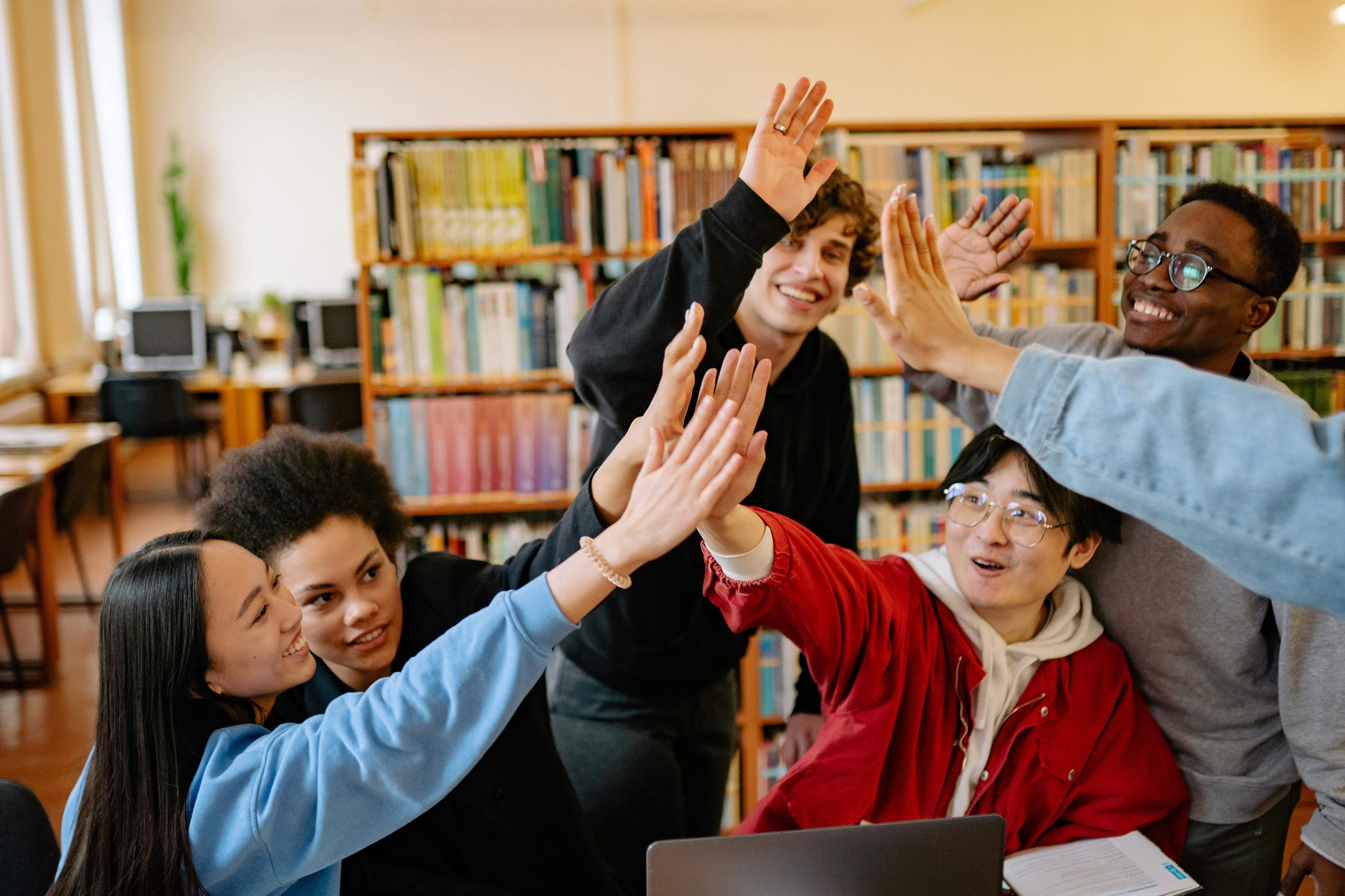
Target Audience
The path to success isn't always a straight line, it’s rather a series of steps.
The path to success isn't always a straight line, it’s rather a series of steps.
The path to success isn't always a straight line, it’s rather a series of steps.
The idea
This understanding shaped our logo design, symbolizing guidance and growth. The upward arrow represents our commitment to continuous improvement, while the staircase signifies our progress through key milestones.
The idea
This understanding shaped our logo design, symbolizing guidance and growth. The upward arrow represents our commitment to continuous improvement, while the staircase signifies our progress through key milestones.
The idea
This understanding shaped our logo design, symbolizing guidance and growth. The upward arrow represents our commitment to continuous improvement, while the staircase signifies our progress through key milestones.


Logo Migration
Logo Migration
Logo Migration
The colours
This understanding shaped our logo design, symbolizing guidance and growth. The upward arrow represents our commitment to continuous improvement, while the staircase signifies our progress through key milestones.
The colours
This understanding shaped our logo design, symbolizing guidance and growth. The upward arrow represents our commitment to continuous improvement, while the staircase signifies our progress through key milestones.
The colours
This understanding shaped our logo design, symbolizing guidance and growth. The upward arrow represents our commitment to continuous improvement, while the staircase signifies our progress through key milestones.

Looking towards the future, we've chosen a vibrant color palette that reflects the energy and creativity of our Gen X target audience, who will be joining us in the coming years. This vibrancy also resonates with the artistic spirit of SCAD, where students are surrounded by bold colors in everything from furniture to clothing.
The blue in our logo serves as a steady anchor, grounding our brand identity within this vibrant sea of creativity.


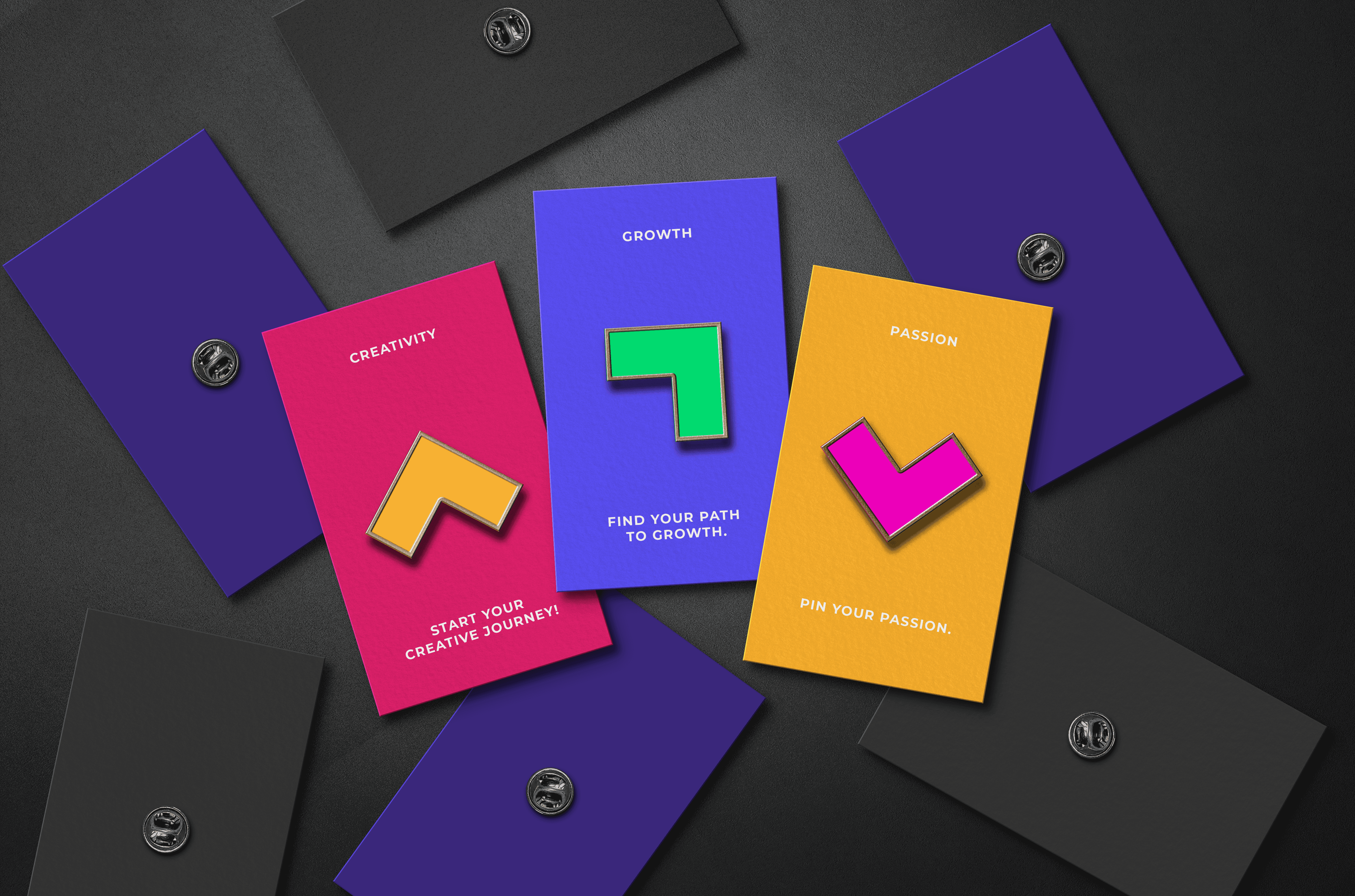
The arrow in our logo transitions into four distinct colors, each representing key principles of our brand. These colors symbolize our core values, while the changing direction of the arrow reflects our multifaceted nature and our role in guiding students on their journey.
Logo colour variations and spacing guidelines
Logo colour variations and spacing guidelines
Logo colour variations and spacing guidelines
Pattern Usage
Pattern Usage
Pattern Usage


I N T R O D U C I N G
SCAD Start Up
I N T R O D U C I N G
SCAD Start Up
I N T R O D U C I N G
SCAD Start Up


Wayfinding Posters
Wayfinding Posters
Wayfinding Posters